HEADPHONES PRODUCT DESIGN

OBJECTIVE:
To increase the usability of Skullcandy headphones and enhance the user experience.
Problem 1:
There are a lot of functions to remember. In order to use the headphones, the user has to memorize how to play, pause, skip forward/backwards, & increase/decrease the volume. It is a lot for a user to learn, let alone remember. Without memorizing all of these, the product becomes unusable.
Problem 2:
Skullcandy headphone’s function button is used for all primary functions and is located on the face of the headphone bud. In order for the user to perform tasks, they are required to push with a decent amount of force, causing discomfort from the headphone being pushed into the ear.
Persona
I created this persona to understand the thought process and personality of the target market for the product. By getting into the mind of the user, I am able to create a better user experience.

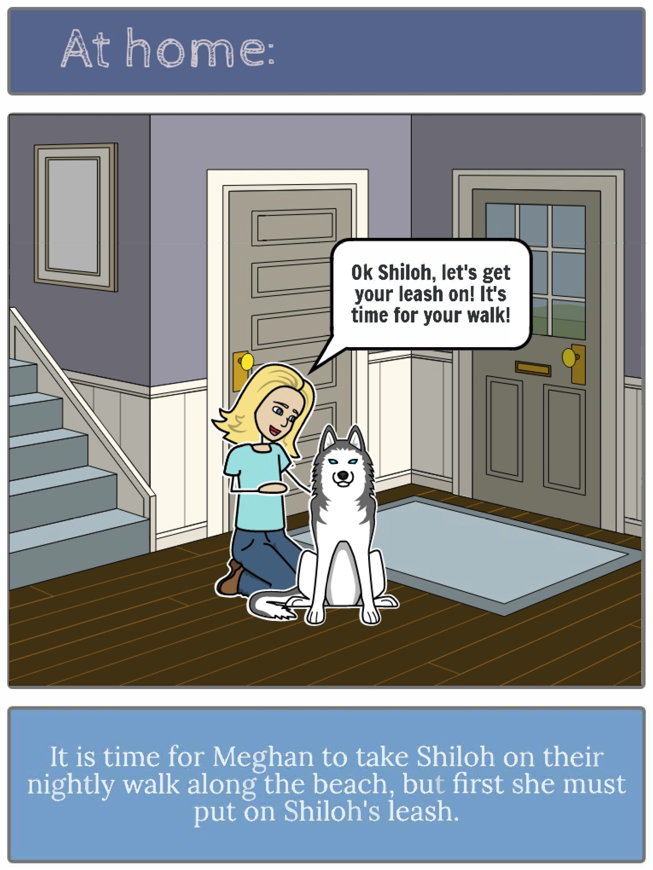
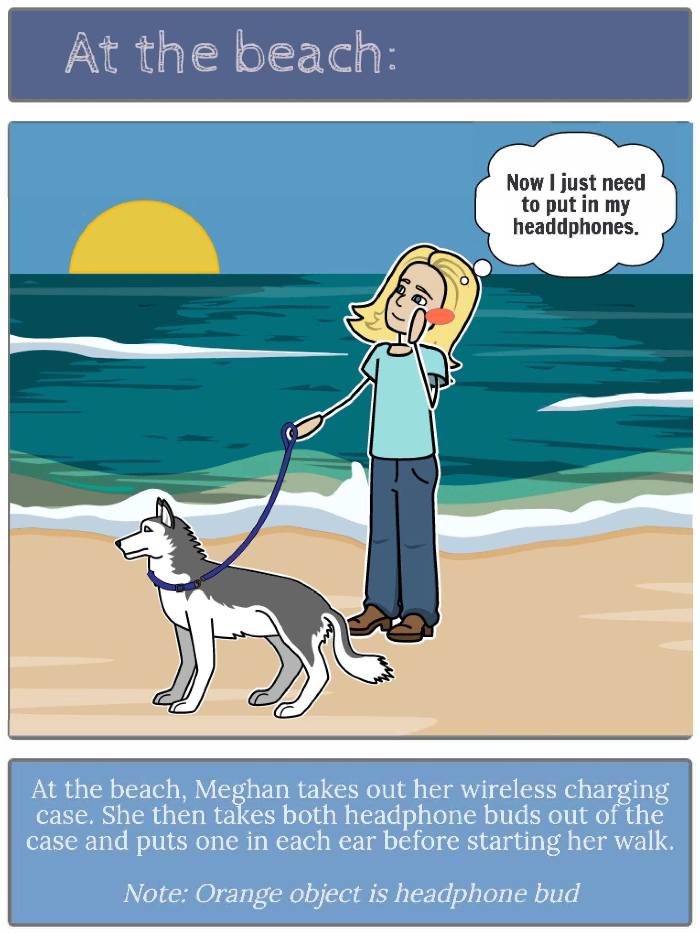
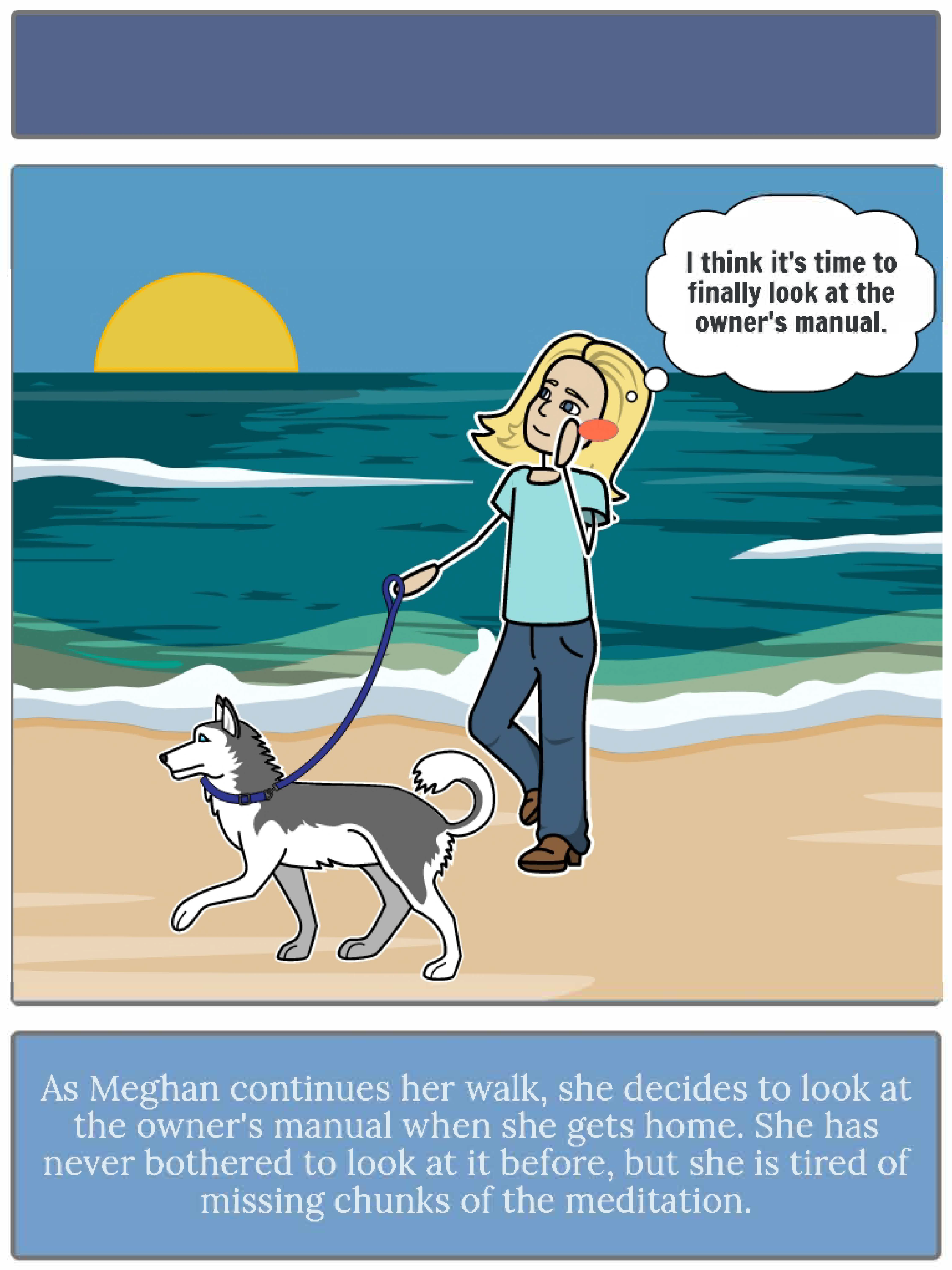
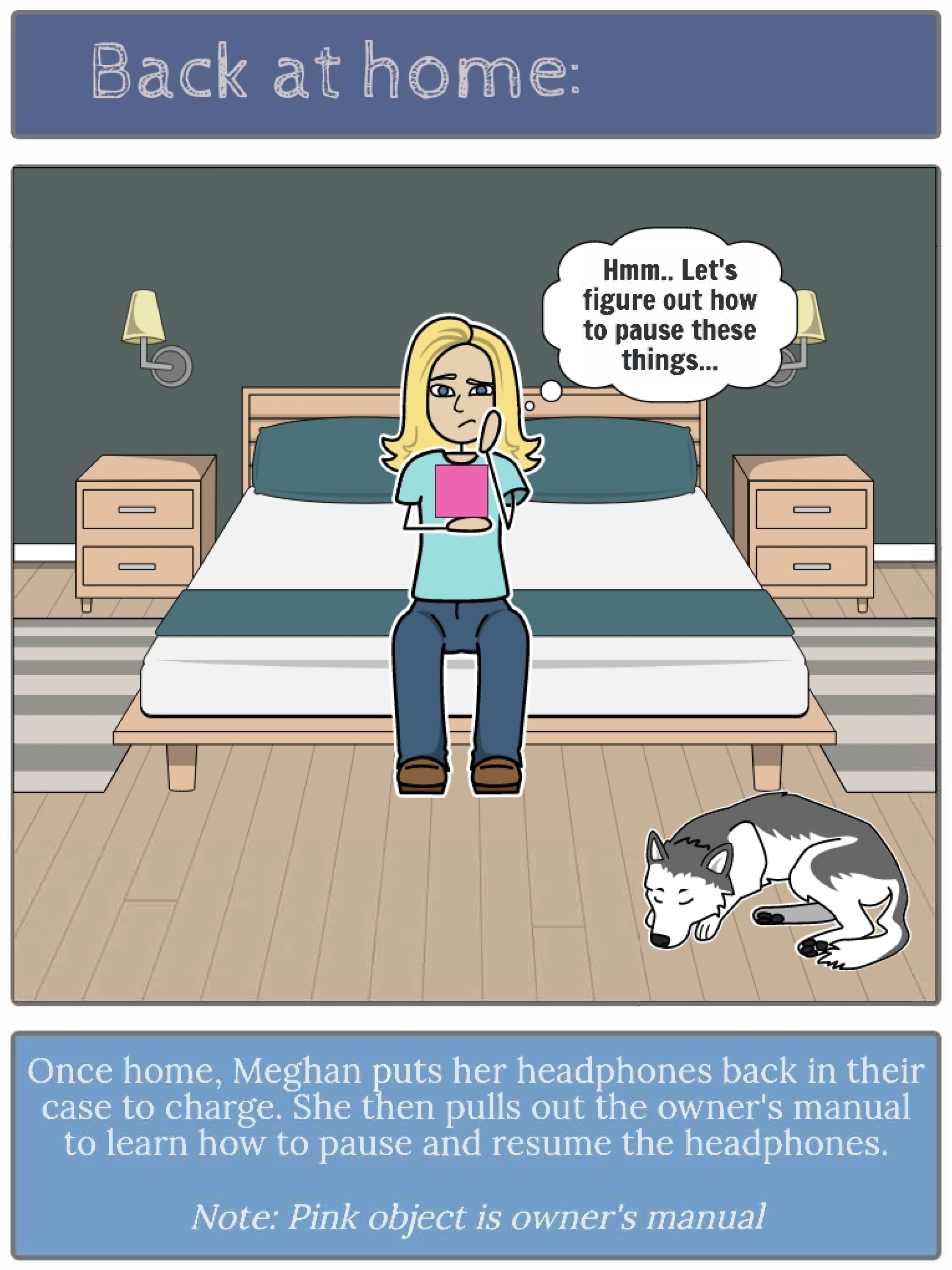
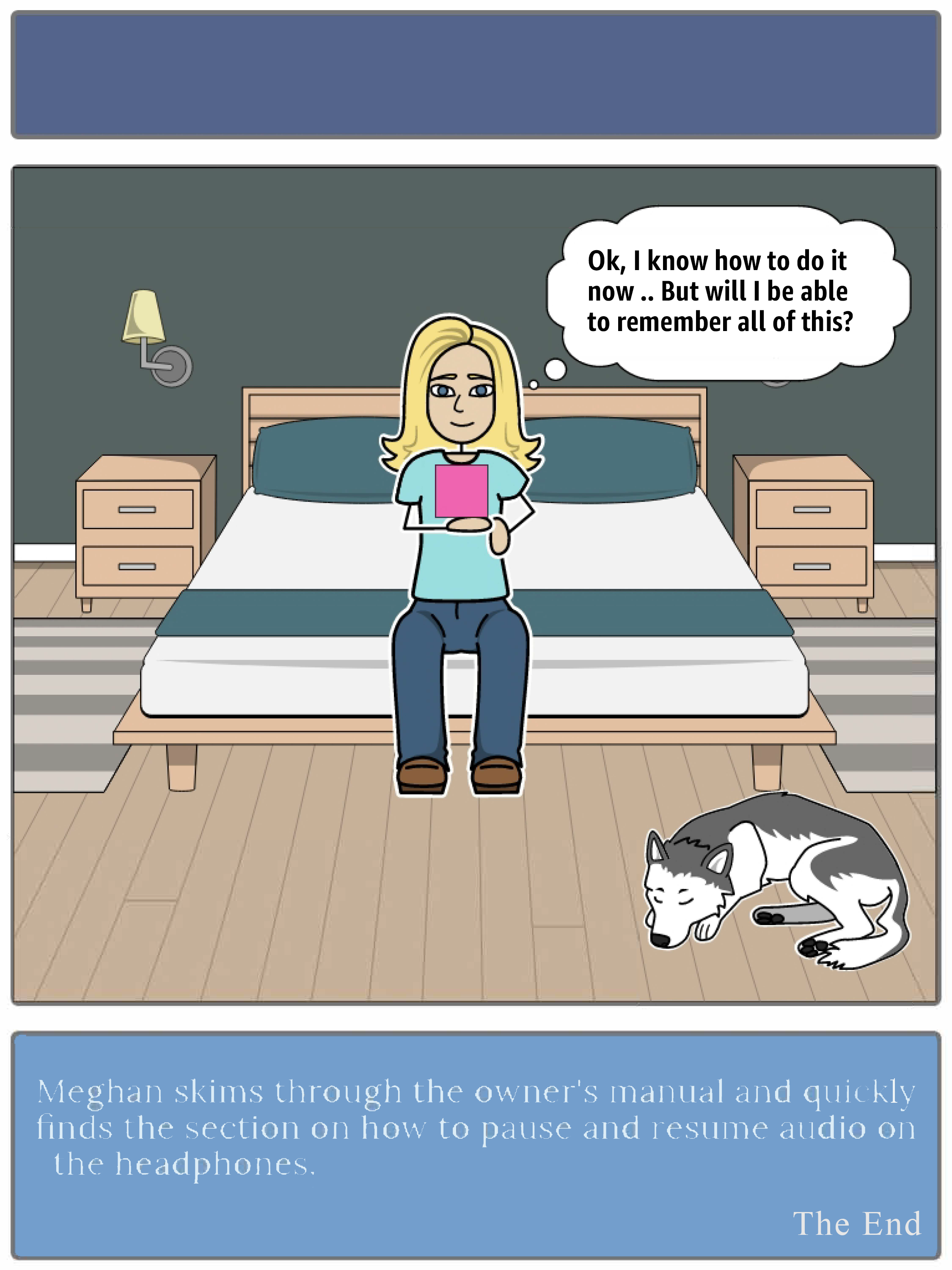
StoryBoard
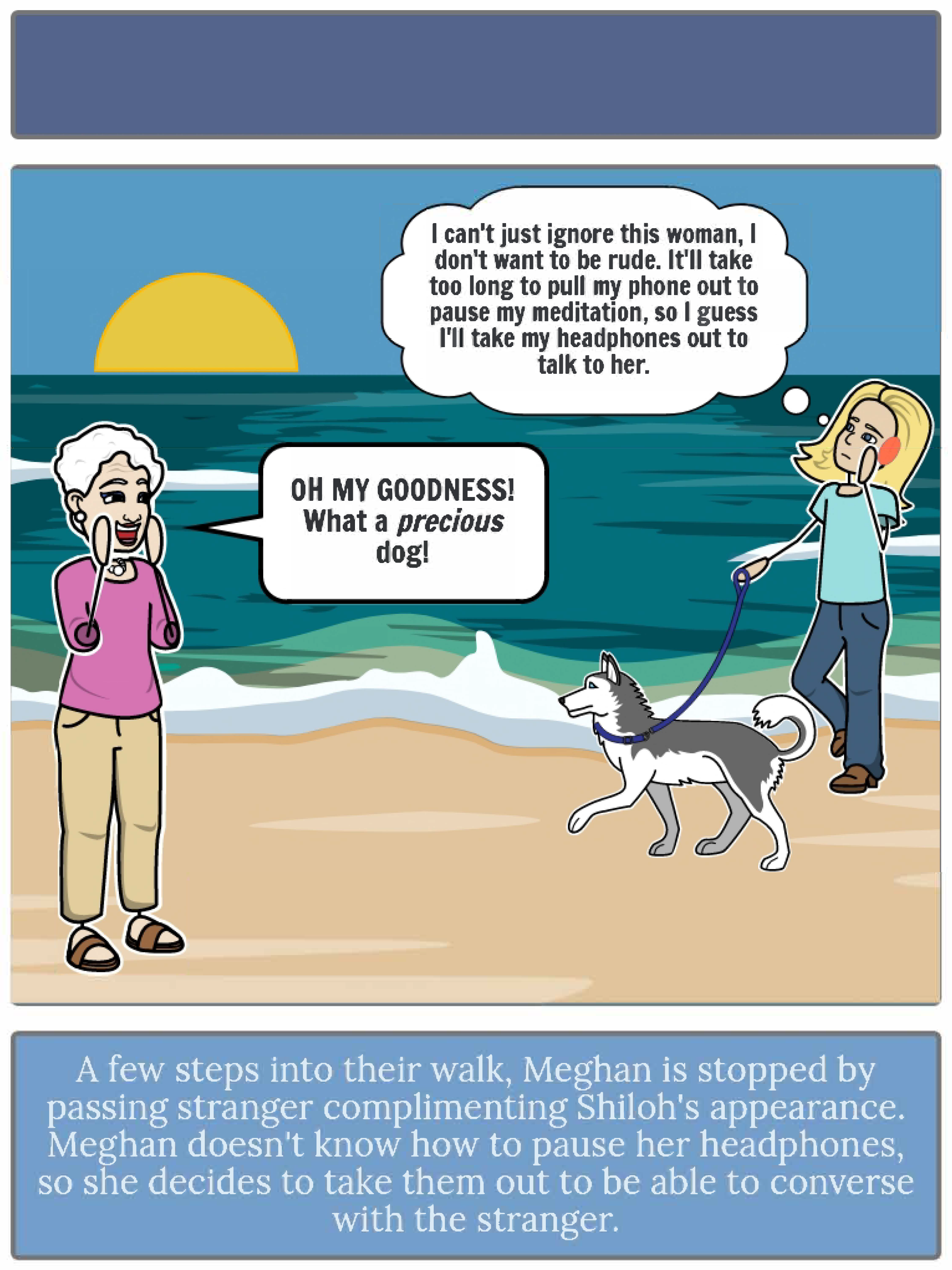
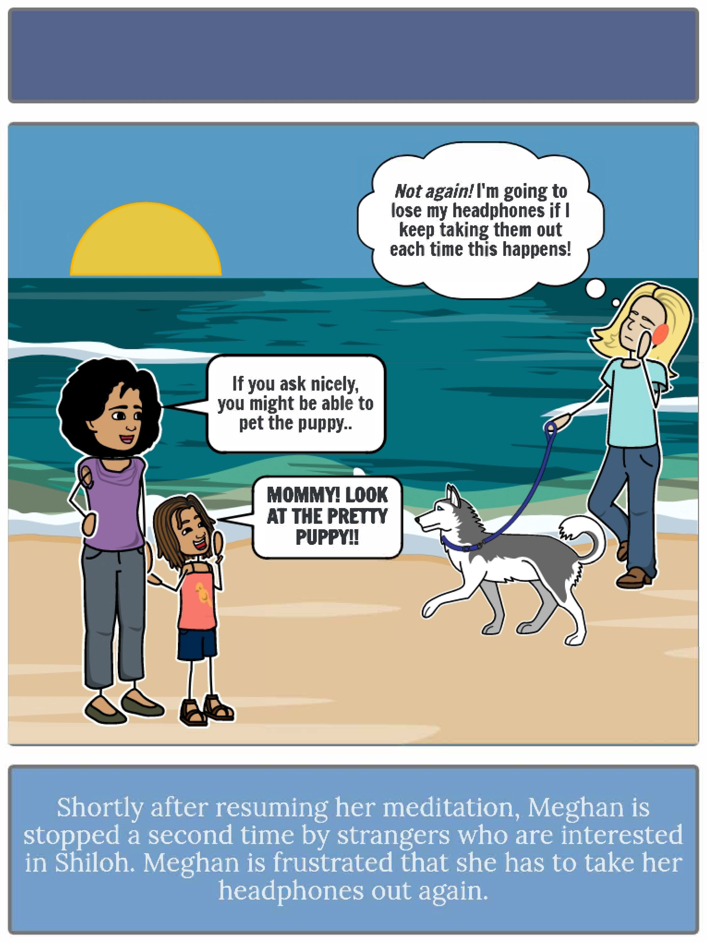
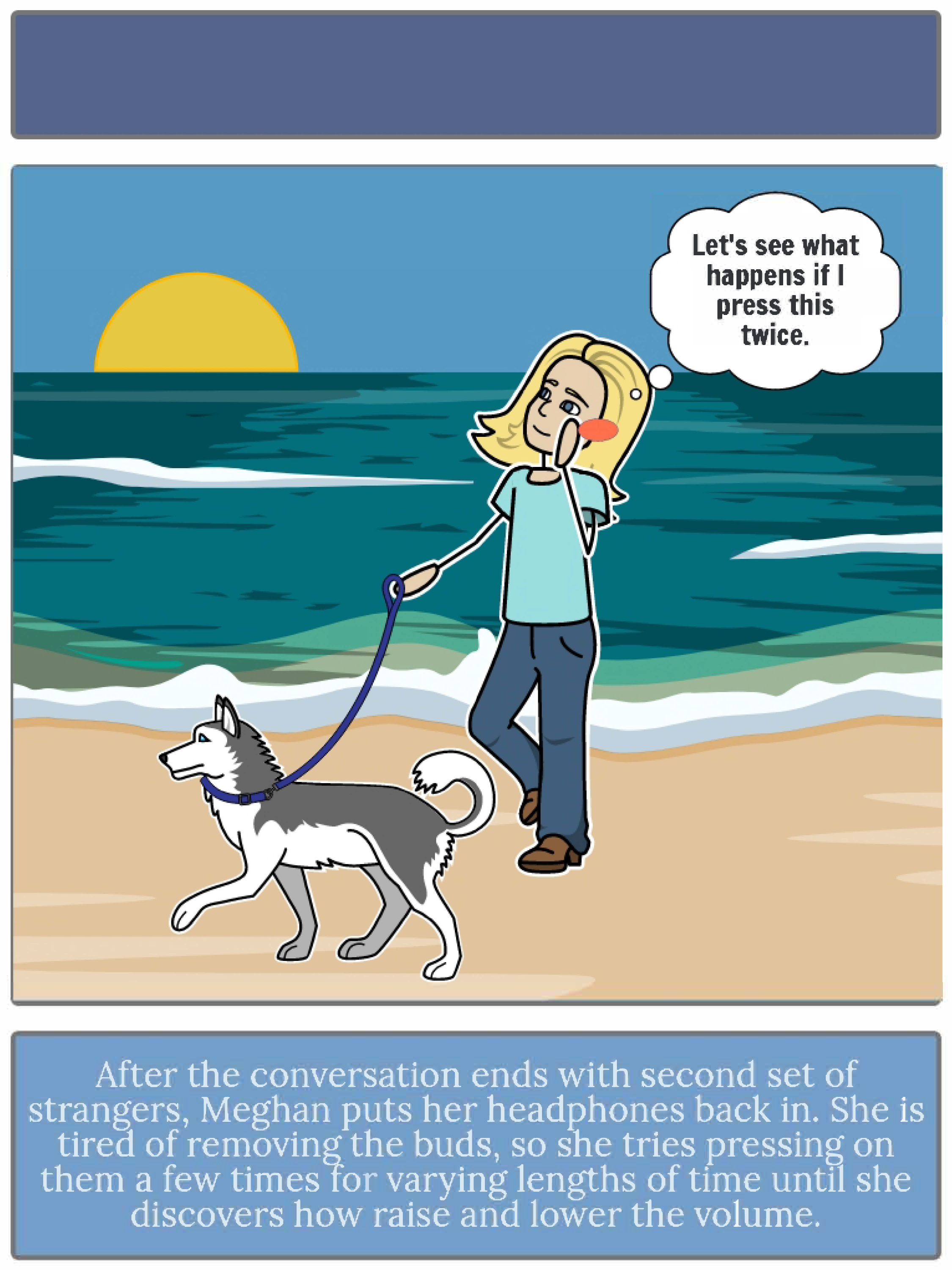
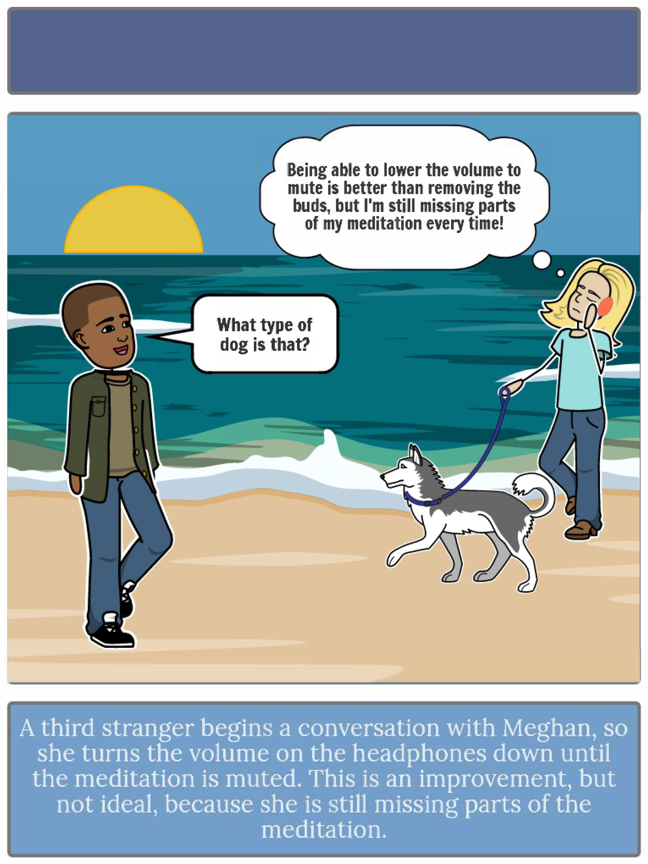
Meghan, our primary persona, has an extremely stressful job and likes to relax during her free time. To destress after work, she listens to a meditation while taking her dog on a walk along the beach. The following slides depict possible scenarios that Meghan would be in while performing primary tasks with the headphones — pausing/resuming audio & increasing/decreasing audio volume. This storyboard highlights Meghan’s frustrations and reinforce that problem 1 (mentioned earlier) is a problem that is affecting the user experience of the product.


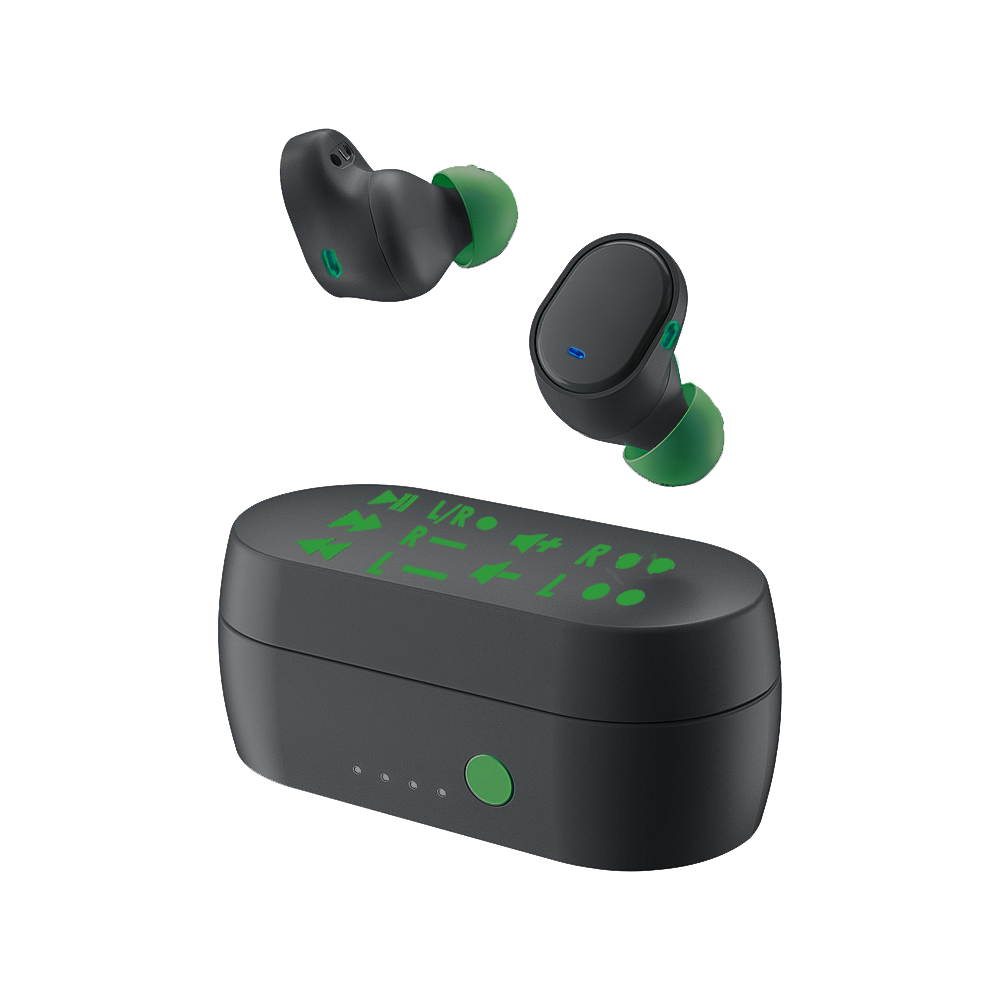
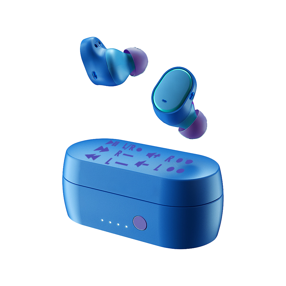
PRoblem 1 Solution
To save the user from having to memorize the full functionality of the product, the functions will be printed on the top of the charging case. This solution is ideal because it will not affect users who are familiar with the product and do not need help learning or memorizing tasks, and will be in an easy to access location for the users that it will benefit. To create the text, I used icons that are already well-established icons that indicate the tasks such as play/pause, volume up/down, ecetera. to avoid any confusion from the user. To visually indicate to the user how to perform the task, I first listed “L” or “R” to indicate to the user which headphone the task uses, to finish I opted to use a code similar to Morse Code’s dots and dashes to indicate whether the user should press the button quickly or hold it down. I decided to do this because Morse Code is well-known. Even if most people don’t know its alphabet, they understand the concept so it is an effective way to represent tasks without taking up much surface area. The picture on the right is my original sketch from when I was brainstorming solutions.

Prototype
I created the prototype out of clay to show the design of the product. I added a video to show the steps the user would take to play and pause audio using the buds.

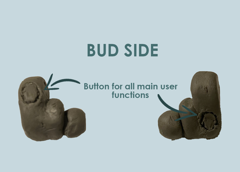
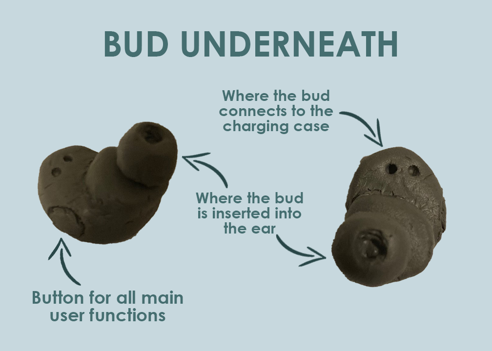


PRoblem 2 Solution
To solve the second design problem — the function button location — I changed the placement of the button. Instead of being located on the face of the bud, I placed two buttons - one on either side of the bud. I chose to stagger the placement so that the button on one side would be lower on the bud, and the button on the other side to be higher on the bud. I did this because if both buttons were higher up on the bud it could cause the bud to be moved and come out of the user’s ear. This solves the problem because the user is no longer required to press with force against their ear to use the headphones.
