CompassionArt E-Commerce Website

Objective
To create and test an e-commerce site for a company that sells art prints and donates a portion of proceeds to charity.
Design Brief
Company Background
CompassionArt was founded in 2019. The company sells artwork including both NFTs and prints. They donate 25% of the proceeds from each sale to charity and have multiple partnering charities with various causes. Which charity receives the donation is dependent on the art’s subject matter. The subject matter of the art we sell is required to relate to one of the four main causes: the environment, animals, hunger, and the arts. For example, if a landscape piece is sold, a quarter of the proceeds would be donated to one of our partnering environmental charities. Similarly, if an abstract piece is sold, the proceeds will go to one of our partnering art charities.
CompassionArt currently features over 30 artists’ work. Anyone can apply to have their work sold on the site, provided the subject matter falls into one of our charitable categories. While the artist’s commission is lower than if they sold their work directly, many artists partner with the company mainly to increase their work’s exposure at a rate they are unable to replicate themselves. The artist also has the benefit of knowing they are helping to give back to the community.
Design Goals
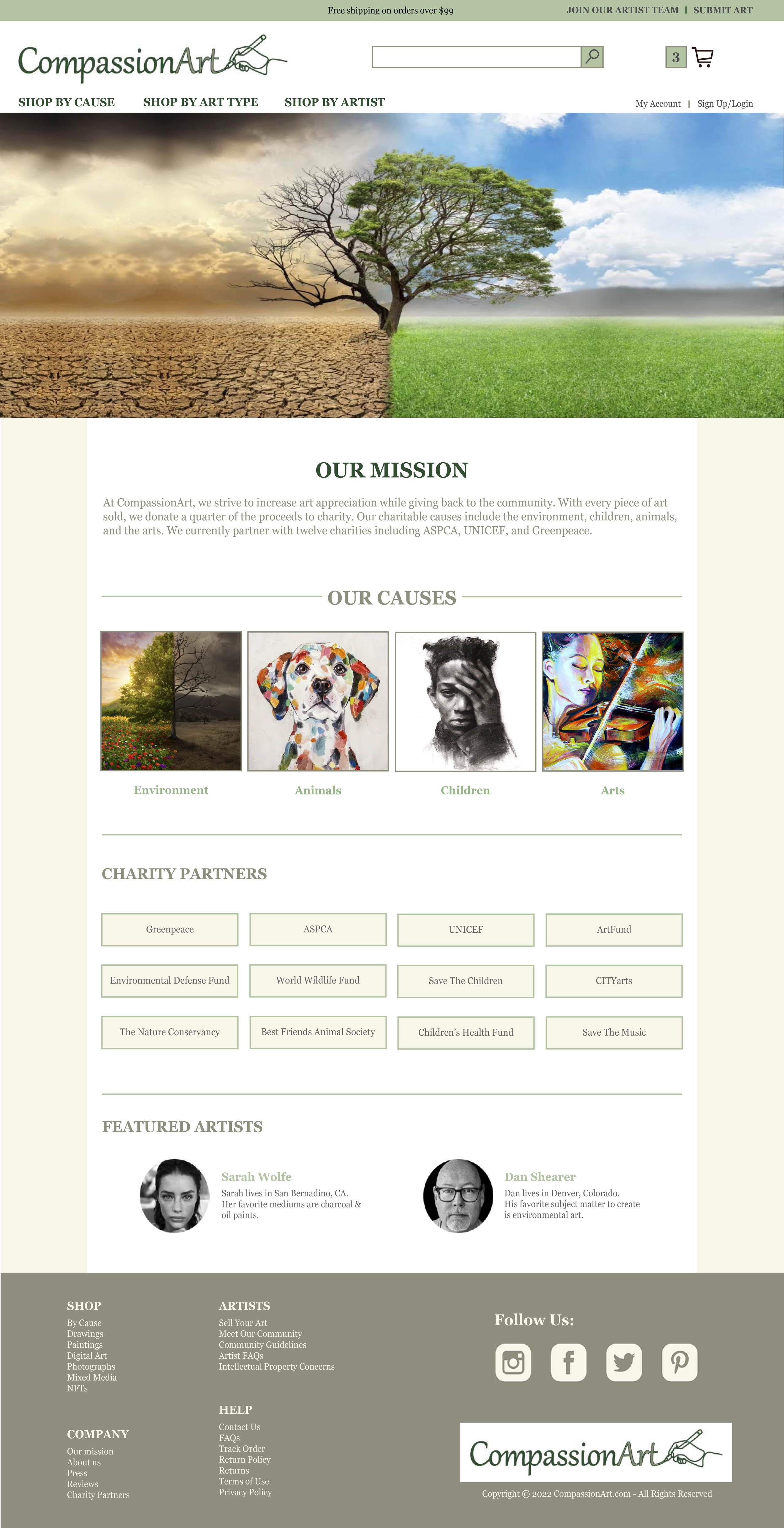
The overall goal of the new design project is to create a website to effectively showcase the artwork for sale while clearly highlighting the company’s mission of giving back to the community. CompassionArt’s main competitors are Fine Art America and society6; both are companies that allow artists to submit their work to be sold by the company’s site. CompassionArt differs from their competitors though, they donate part of every sale to charity. Therefore, the top priority with this project is to increase awareness of our company’s charitable donations to help set us apart from our competitors. The company would like it to be obvious to the customer that the donation is already included in the price of the artwork. There should also be an option during checkout for the customer to donate an additional amount to the related charity, if selected. Lastly, it should be clear that anyone can apply to have their artwork sold through the site, provided the art’s subject matter falls into one of the four charitable categories.
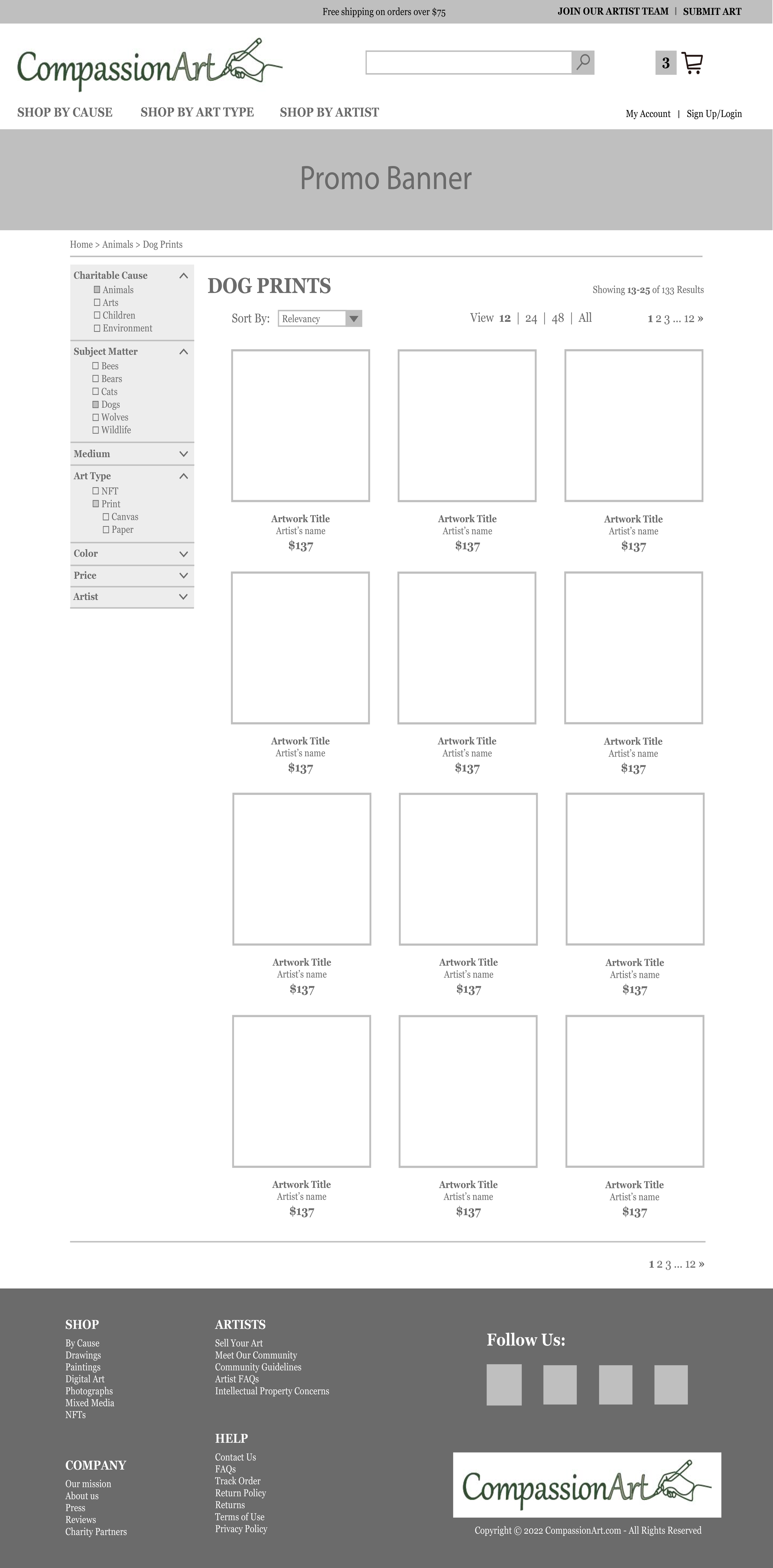
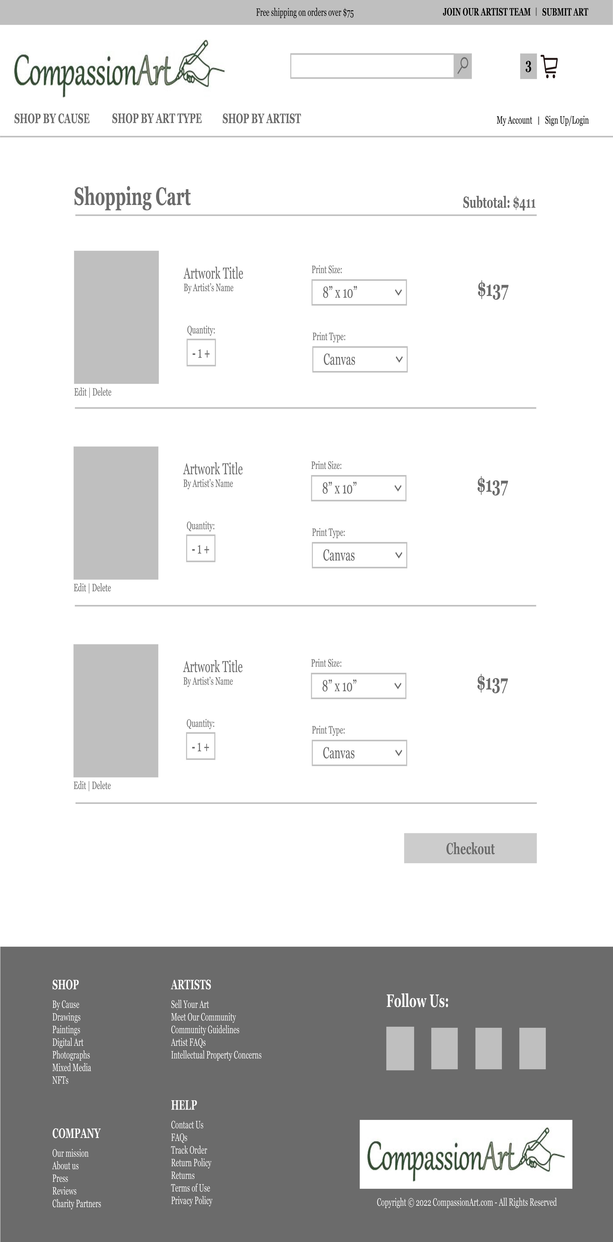
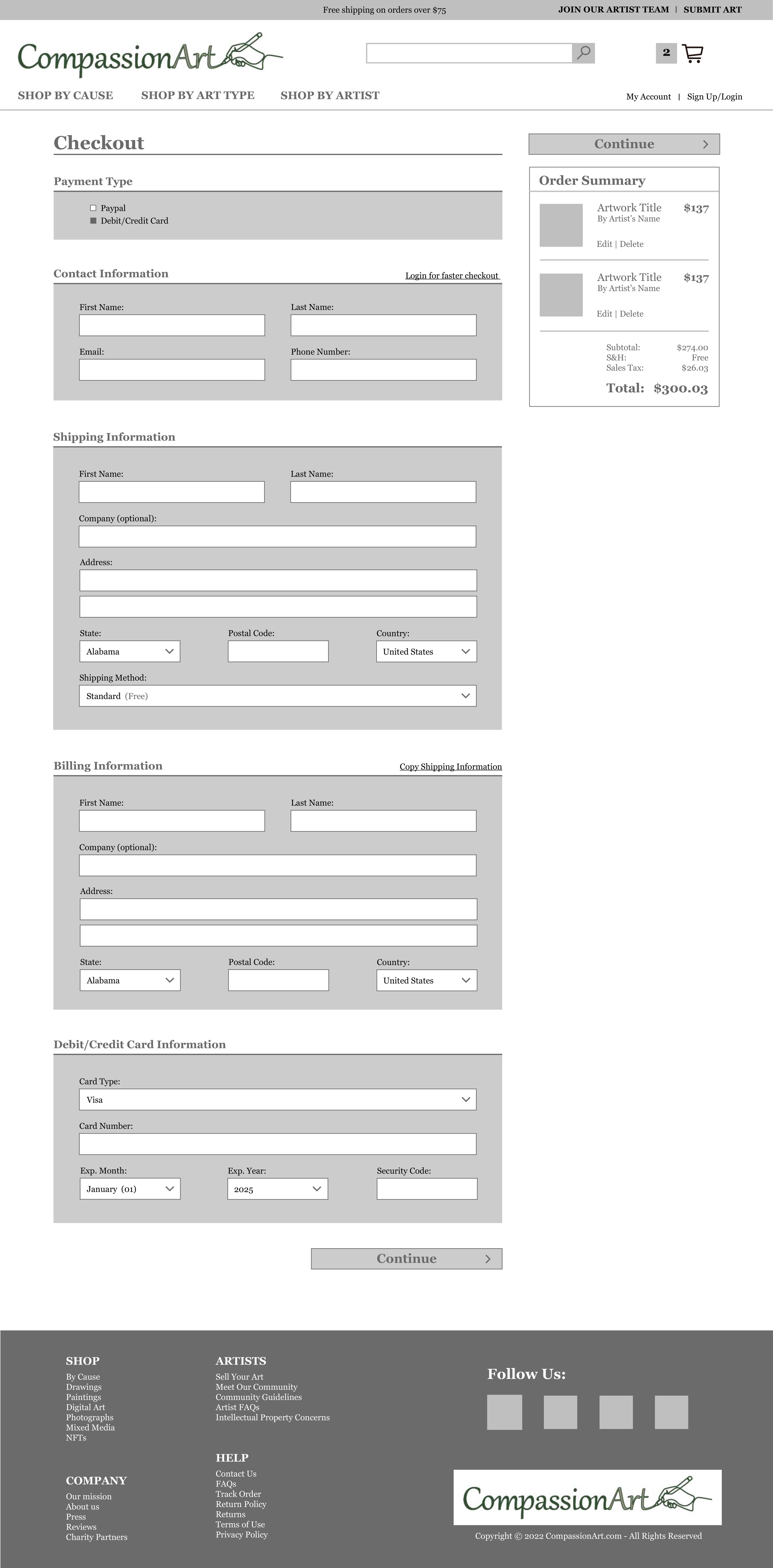
The project will need to include a home page, category page, product page, cart page, and checkout page.
Target Market
Our target market is charitable, socially-conscious Americans between 30-50 years old. The annual income range for our target market is $75,000 - $100,000.
Style Guide


Wireframes


Mockups


Prototype
I created the prototype in AdobeXD so that I could perform user tests.
USABILITY Testing
Decide Evaluation
Determine the Goals
Goal 1: evaluate the navigation and functionality of the prototype
One of the main goals of this evaluation is to test the navigation and function of CompassionArt’s website. As the UX design consultant to CompassionArt, I plan to test the user’s ability to navigate throughout the site and complete tasks. This will ensure that the site is simple to use and has all of the functions the user expects.
Goal 2: test the branding and desirability of the site’s design
The other main goal of this evaluation is to test the site’s branding and desirability. This will ensure that the design is consistent with the company’s purpose and values. It will also ensure that the site’s design positively influences the user’s attitude towards both the site and CompassionArt as a whole.
Explore the ?’s
a. The main goals are broken down into specific questions in a questionnaire that I had the user answer following the task observation.
b. The first goal is to test the navigation and function of CompassionArt’s website.
i. Is the site simple to use?
ii. Does the system assist the user to complete tasks efficiently?
iii. Does the system assist the user to complete tasks effectively?
iiii. Does the site include all of the functions/capabilities the user expected?
c. The second goal is to test the branding and desirability of the site
i. What is the user’s attitude towards the site as a whole?
ii. What is the user’s attitude towards the design of the site?
iii. Does the branding of the site align with the company’s purpose and values?
iiii. Would the user purchase from this site?
Choose the evaluation approach & methods
a. The Interview
i. Prior to the observation, I conducted a brief interview with each user including the following questions:
Have you ever purchase anything online?
How often do you shop online: daily, bi-weekly, weekly, monthly, or every 3 months?
What is your favorite ecommerce site?
What do you like about that website?
Have you ever been on a site that sells artwork?
I’m going to ask you to follow certain tasks on a website prototype; what do you expect to see on an ecommerce site?
b. The Observation
i. During this observation, I asked the user to complete a set of tasks, without using the search bar, to test the usability of the site. I requested that the user thinks aloud while performing the tasks. By having the user verbalize what they are thinking I will be able to better understand their thought process and also if the site behaves as the user expects.
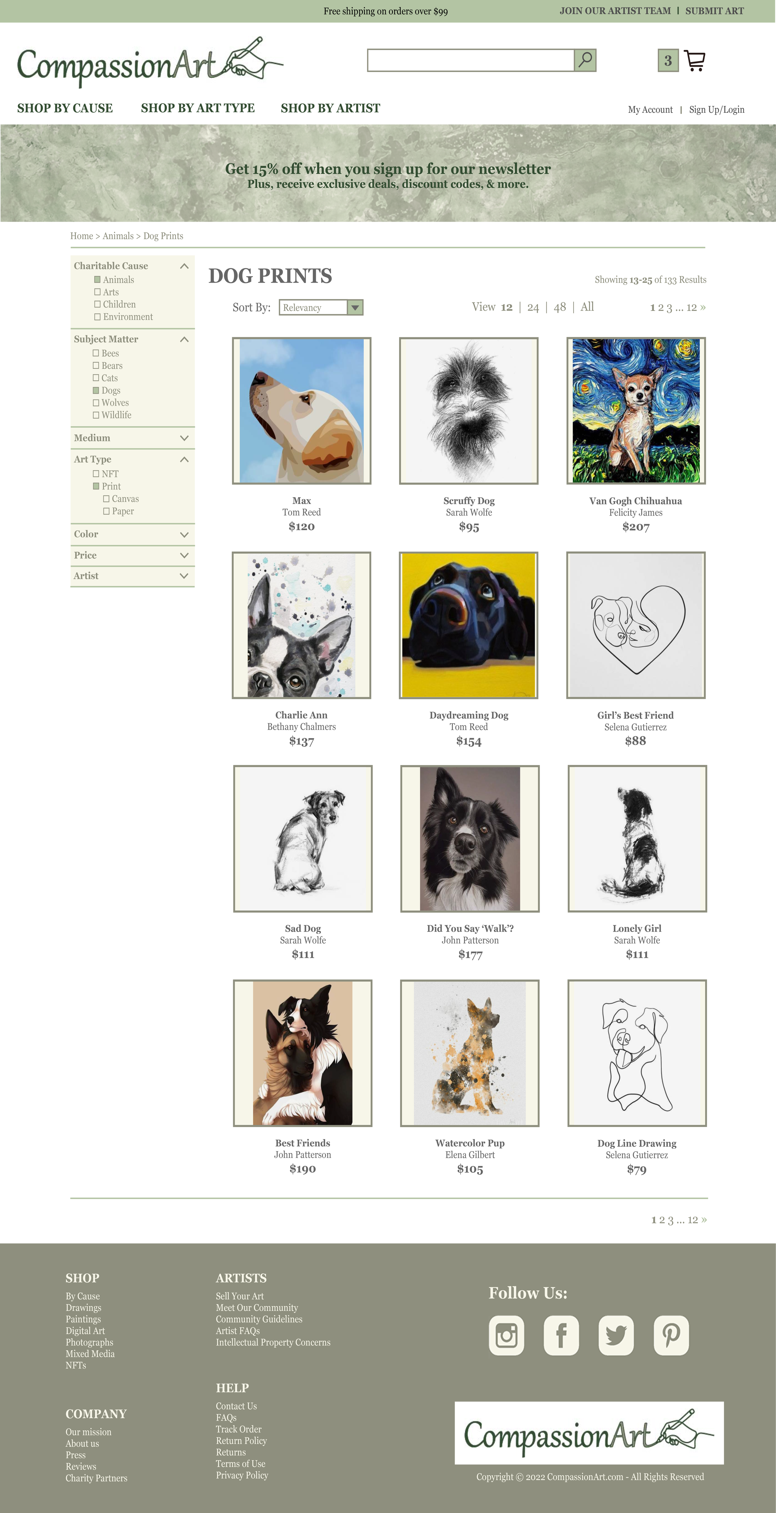
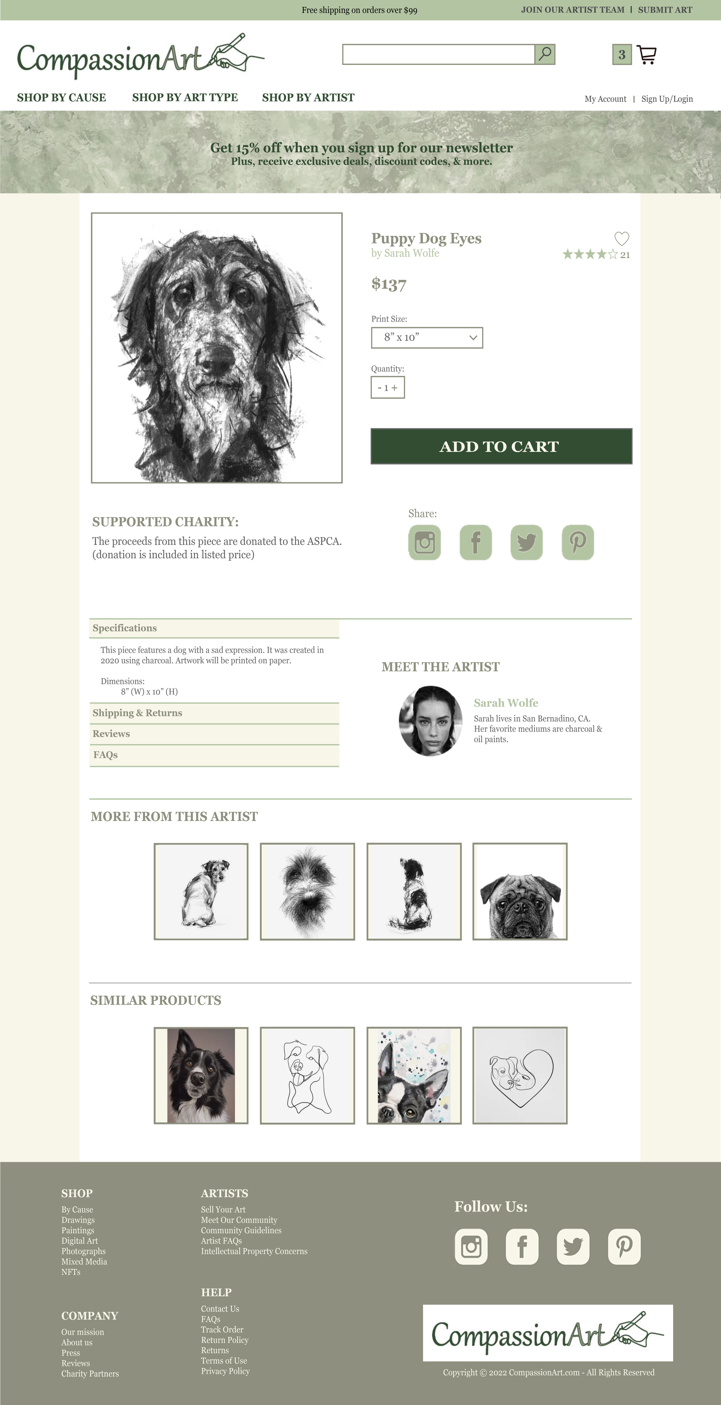
Task 1: Find the artwork titled “Puppy Dog Eyes”
Task 2: Select a 16” x 20” paper print.
Task 3: Add the item to your shopping cart. How do you know it’s been added your cart?
Task 4: Return to homepage.
Task 5: Find the artwork titled “Little Girl” and add it to your cart.
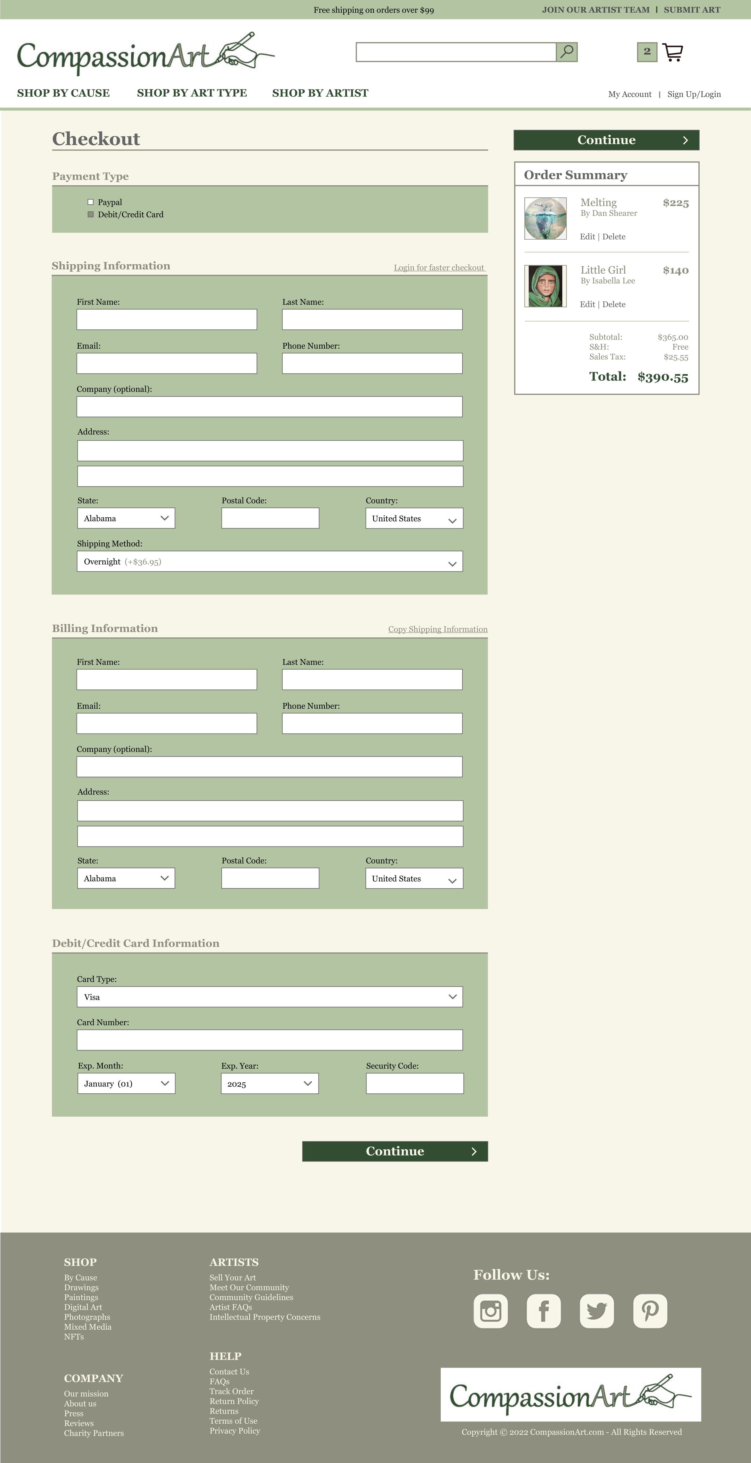
Task 6: Proceed to checkout, select overnight shipping, and complete the checkout process.
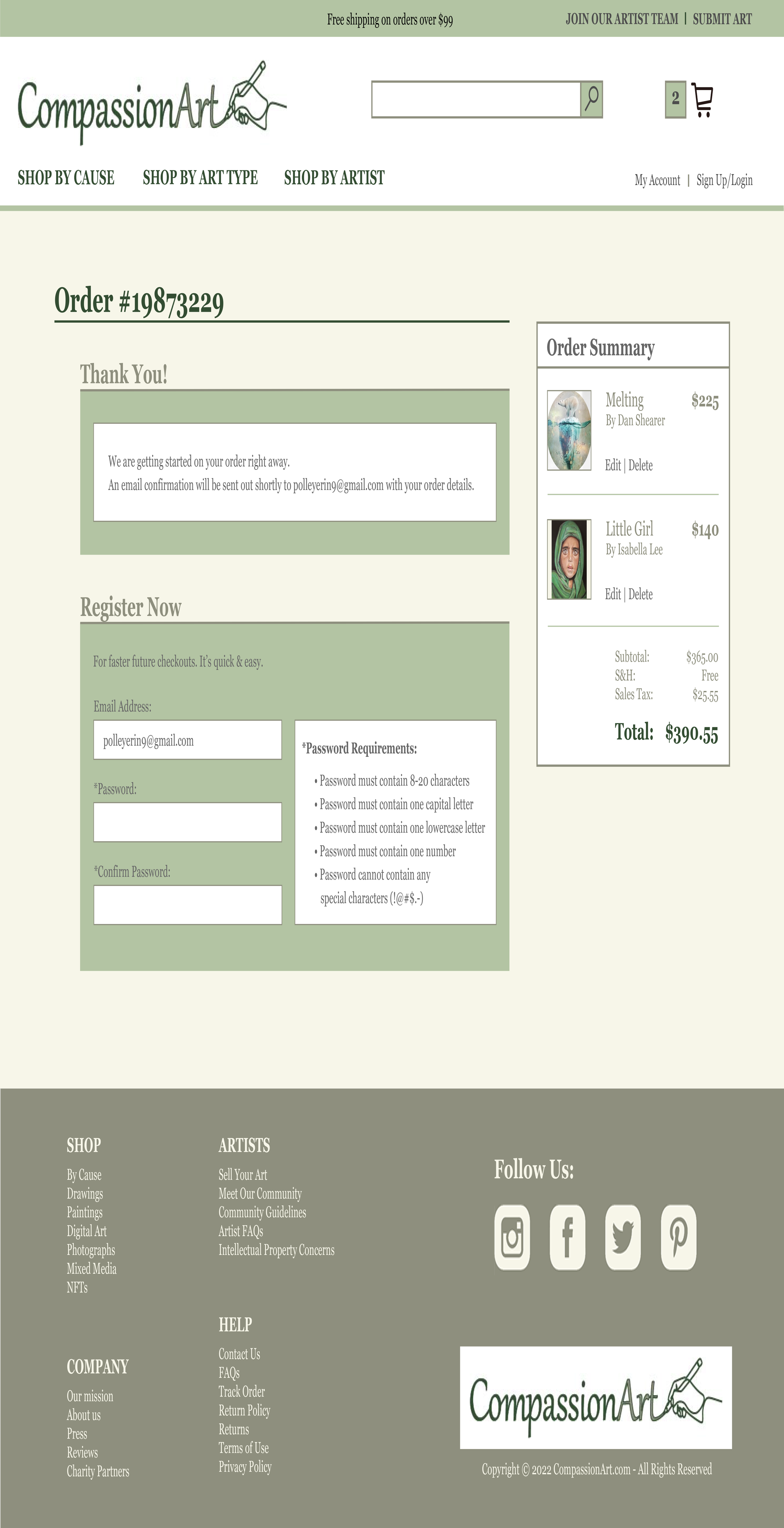
Task 7: How do you know if the checkout is complete and successful?
c. The Questionnaire
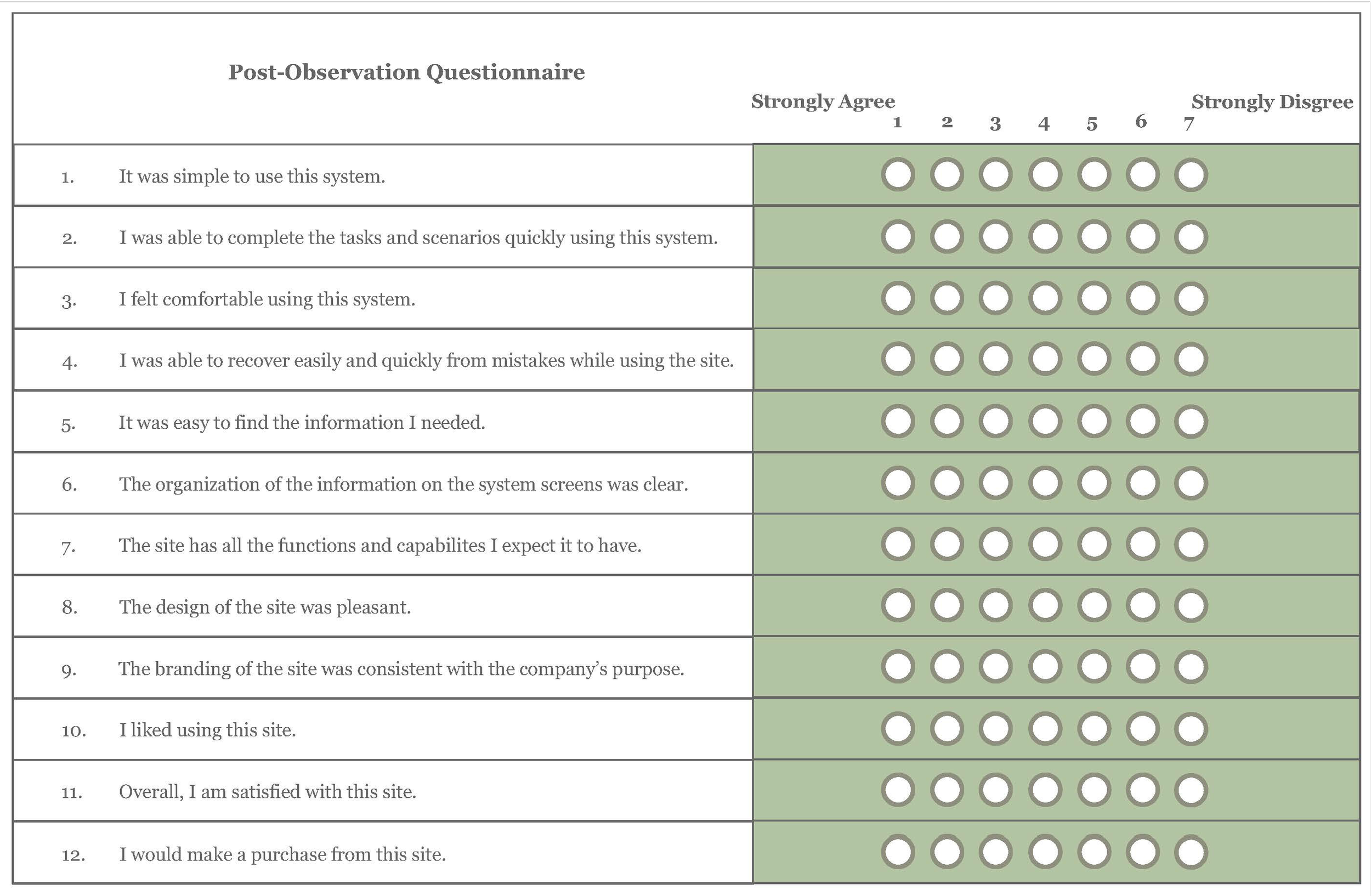
i. Following the observation, I asked each user to complete a questionnaire. This allows me to answer the questions that this evaluation is investigating with more accuracy. For each question on the questionnaire, I included 7 options. Think Like A UX Researcher by David Travis & Philip Hodgson suggest that when the questions pertain to how the user feels about something, to include more options — 7 specifically — so that the user has a wide range of answer possibilities. I also made sure to clearly label how the scale is ranked, and kept it consistent for all the questions, as also recommended by the textbook. Below is the questionnaire that was filled out by each user:
Identify Practical Issues
a. I selected a diverse group of users to assure that the site has good usability across a wide range of users. I did not restrict my user selection with any demographic requirements. I was the only person conducting this evaluation.
b. The equipment I used this evaluation includes a pen and paper to take notes and a copy of the questionnaire for each user, to be passed out after the observation. I also used my computer to show the prototype that the users completed the tasks with. I verbally explained each task.
Decide About Ethical Issues
To avoid ethical issues, this is the form I gave to each user prior to conducting the test or interview.
a. The goal of this study is to evaluate the navigation and ease of use of CompassionArt’s website, as well as how the website’s design reflects the company’s brand. During this study, you will be verbally asked a few interview questions, be prompted to complete a handful of tasks on the website prototype, and finally to fill out a short questionnaire at the end. This study is to judge the design and capabilities of the website, not you. You cannot do anything wrong. and your performance will only help to improve the website. Your name and contact information will be kept private. Your age, occupation, and similar information will be shared with CompassionArt to judge the demographics of this study. Your information will only be shared internally by CompassionArt. If you feel uncomfortable, please tell the evaluator and you can leave the study at any time. If at any point you have any questions, don’t hesitate to ask the evaluator. The evaluator may not be able to answer immediately if answering the questions will affect the study.
b. Please Print Your Name: ______________________
c. Please Sign Your Name: _______________________
d. Please Print the Date: ___ / ____ / ____
Evaluate, Interpret, & Present Data
a. Description of Users
i. User 1 - 25 year-old, female, framer at Michael’s Arts & Crafts store, has been on a site that sells artwork
ii. User 2 - 31 year-old, female, store manager at Michael’s Arts & Crafts store, has been on a site that sells artwork
iii. User 3 - 69 year-old, male, retired lawyer, has never been on a site that sells artwork
iv. User 4 - 53 year-old, female, preschool teacher, has been on a site that sells artwork
v. User 5 - 19 year-old, non-binary, student at Ringling College of Art & Design, has been on a site that sells artwork
b. Individual Results
i. User 1
1. She shops online weekly. Her favorite ecommerce site is HoloTaco. She likes the site because of the company’s values, variety of products, and quality of products.
2. On an ecommerce site, she expects to see customer service contact information, prices, customer reviews, FAQ’s, and a copyright date.
3. Task 1 - She used the “shop by cause” navigation on the top of the screen and selected animals. She then used the filter menu to select “dog prints”.
4. Task 2 - She changed the print size to 16” x 20” without issue.
5. Task 3 - She used the “add to cart” button and knew the item was in the cart because the site brought her to her cart.
6. Task 4 - She clicked on the CompassionArt logo on the top of the screen to return to the homepage.
7. Task 5 - She used the “shop by cause” on the top of the screen, selected children, then the first product shown by clicking on the product’s title, then pressed the “add to cart” button.
8. Task 6 - She pressed the “checkout” button on the top right of the shopping cart. She immediately scrolled through to select overnight shipping.
9. Task 7 - She knew the checkout process was successful because the site brought her to a confirmation message screen.
ii. User 2
1. She shops online daily. Her favorite ecommerce site is Threadless.com. She likes that a portion of each sale goes to the artist that designed the product. She also likes that the products are showcased being work/used in real life situations.
2. On an ecommerce site, she expects to see a search bar, shopping cart, product pictures, and product reviews.
3. Task 1 - She pressed the “animal” category picture from the homepage. She then scrolled through the products until she saw “Puppy Dog Eyes”.
4. Task 2 - She changed the print size to 16” x 20” without issue.
5. Task 3 - She used the “add to cart” button and knew the item was in the cart because the site brought her to her cart.
6. Task 4 - She scrolled the site for a minute, then clicked on the CompassionArt logo on the bottom of the screen to return to the homepage.
7. Task 5 - She pressed the “children” category picture from the homepage. She scrolled through the products, then scrolled to the top of the product list and selected the product by clicking on the product title. She added it to her cart using the “add to cart” button.
8. Task 6 - She pressed the “checkout” button on the bottom of the shopping cart. She looked at the page for a few seconds, then scrolled through to select overnight shipping.
9. Task 7 - She knew the checkout process was successful because the site brought her to a confirmation message screen.
iii. User 3
1. He shops online monthly. His favorite ecommerce site is Amazon. He likes that the site is easy to use and navigate. He also likes the convienience of the site.
2. On an ecommerce site, he expects to see product pictures, product specifications, and prices.
3. Task 1 - He scrolled on the homepage for a minute, then pressed on the “animal” category title from the homepage.
4. Task 2 - He read the information displayed, then changed the print size to 16” x 20”.
5. Task 3 - He used the “add to cart” button on the product page and knew the item was in the cart because he was brought to his cart.
6. Task 4 - He used the back button on the browser to return to the homepage.
7. Task 5 - He clicked on the “children” category picture from the homepage, selected the first product shown by clicking on the product’s picture, then pressed the “add to cart” button.
8. Task 6 - He pressed the “checkout” button at the bottom of the shopping cart. He looked at the checkout form for a minute, then selected overnight shipping.
9. Task 7 - He knew the checkout process was successful because the site brought him to a confirmation message screen.
iv. User 4
1. She shops online monthy. Her favorite ecommerce site is Amazon. She likes that she can find products easily on the site. She also likes the variety of
products.
2. On an ecommerce site, she expects to see a product pictures, customer reviews of products, and a filter menu.
3. Task 1 - She pressed the “animal” category picture from the homepage. She then scrolled through the products until she saw “Puppy Dog Eyes”.
4. Task 2 - She changed the print size to 16” x 20” without issue.
5. Task 3 - She used the “add to cart” button and knew the item was in the cart because the site brought her to her cart.
6. Task 4 - She used the back button on the browser to return to the homepage.
7. Task 5 - She used the navigation at the top of the screen to select “shop by cause” and selected “children”. She read the product names and selected the product by clicking on the product title. She added it to her cart using the “add to cart” button.
8. Task 6 - She pressed the “checkout” button on the bottom of the shopping cart. She read all the information on the checkout form first, then scrolled to select overnight shipping.
9. Task 7 - She knew the checkout process was successful because the site brought her to a confirmation message screen.
v. User 5
1. They shop online weekly. Their favorite ecommerce site is Depop. They like that the site is a collection of individual sellers, and not run by a large corporation. They also like the customer service on the website, specifically that they receive quick responses to any customer service issues.
2. On an ecommerce site, they expect to see a variety of products and reviews for each product.
3. Task 1 - They pressed the “animal” category picture from the homepage. They then selected “dog prints” on the filter menu and scrolled through the products until they saw “Puppy Dog Eyes”. They clicked on the product’s picture.
4. Task 2 - They changed the print size to 16” x 20” without issue.
5. Task 3 - They used the “add to cart” button and knew the item was in the cart because the site brought them to her cart.
6. Task 4 - They clicked on the CompassionArt logo at the top of the screen to return to the homepage.
7. Task 5 - They pressed on the “children” category picture from the homepage. They selected the first product displayed by clicking on its picture. From the product page, they pressed “add to cart” button.
8. Task 6 - They pressed the “checkout” button at the top right of the shopping cart. They quickly found the shipping selection, and changed it to overnight shipping.
9. Task 7 - They knew the checkout process was successful because the site brought them to a confirmation message screen.
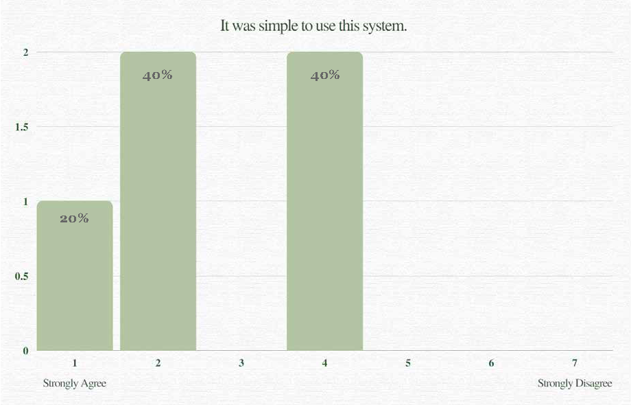
Statistics
i. The questionnaire produced positive responses for the questions relating to the aesthetic design of the system. The questions pertaining to the navigation and ease of use were less complimentary. The following graphs show the questions where the users’ answers vary.


Interpretation of Results
i. The interview portion of the evaluation revealed the online shopping habits of the users and how they vary. One user shops online daily, two users shop online weekly, and two users shop online monthly. This variance is important because it shows that the user group has different levels of experience with shopping online. This difference is beneficial to the study because it will ensure that users of all skill levels are able to use the site without complication.
ii. During the interview process, when asked what they like about their favorite ecommerce site 40% of users stated that they like that the sales benefit individual people, not just a corporation. Another 20% listed the company’s values and views on life as a main reason why the site they chose was their favorite. These results show that a company’s values impact the purchases and shopping preferences of users in this group. This is important to note, because it shows that CompassionArt’s mission of charity work will positively affect the business.
iii. The interview also highlighted what functions and capabilities users expect to see on an ecommmerce site. The answers to this question are important because they will ensure that CompassionArt’s website includes the elements a user would expect to see on the site. Users responded that they expect to see product pictures, prices, filters, product specifications, shopping cart, checkout, search bar, FAQ’s, customer service contact information, and a copyright date for the website. The most significant finding from this question is that 80% of the users in this evaluation stated that they expect to see customer reviews for each product; this highlights the importance of customer reviews on an ecommerce site. According to BigCommerce.com, 91% of people read customer reviews and 84% trust them as much as they would a personal recommendation. BigCommerce.com also states that “reviews are trusted 12 times more than other marketing materials, demonstrating that social proof is a powerful force.” ¹ These statistics prove the importance of including customer reviews for products on an ecommerce site.
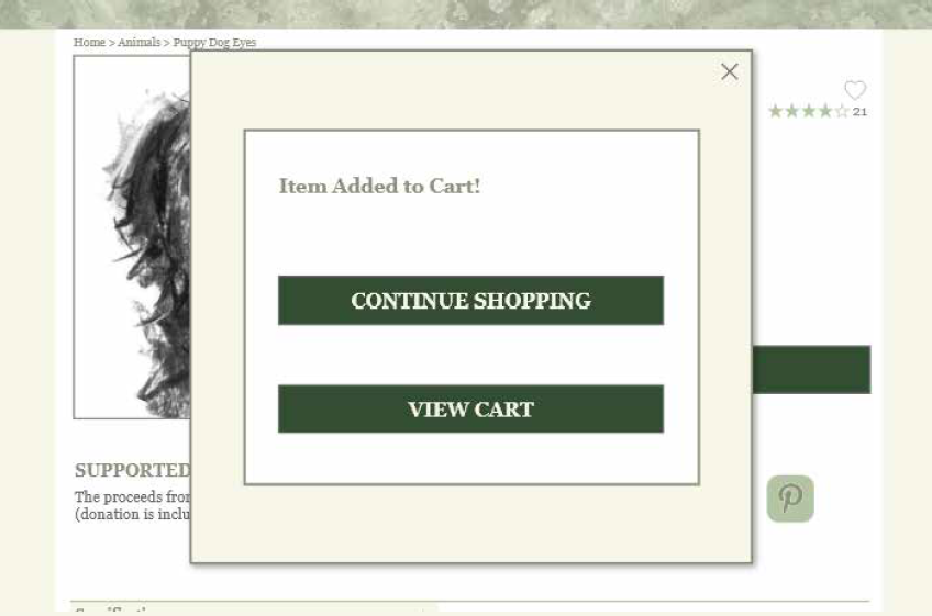
iv. The observation and questionnaire portions of the evaluation revealed the problems with the site’s navigation. The prototype brought users to their shopping cart after pressing the “add to cart” button on the product page. Users struggled to return to shopping after adding an item to their cart. Instead, the website would benefit from a display message showing the item has been added to the cart with buttons that link to the shopping cart. The site would also benefit from a “back” navigation link at the top of the shopping cart page to easily bring the user back to the last page they viewed, so they can return to shopping without issue.
¹ https://www.bigcommerce.com/blog/online-reviews/#who-is-reading-online-reviews
Conclusion
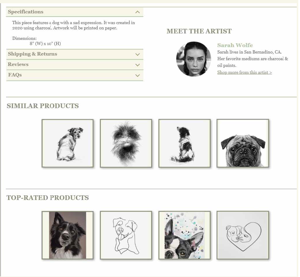
i. The interview process highlighted the users expectations of product reviews. Research confirmed the importance of online reviews. BigCommerce.com found that the average customer is willing to spend 31% more on a retailer that has excellent reviews.¹ Based on these findings, I changed the display on the product page. I added a “top-rated products” section since customer reviews are so influential. To do this, I got rid of the “more from this artist” section, and instead added a link to the artist’s other pieces under the “meet the artist” section. I changed the organization as well to have “similar products” be the top displayed section, to match other ecommerce sites. Lastly, I added shadows behind the product images to give the products dimension.
¹ https://www.bigcommerce.com/blog/online-reviews/#who-is-reading-online-reviews
Original

Revision
ii. The observation and questionnaire both revealed the poor usability of the original prototype in regards to the “add to cart” button. Originally the button would bring the user directly to their cart. During the observation, I found that this was actually a hinderance, and made it more difficult for the user to continue shopping if they wanted to. Therefore, I revised the page to display a message that the item was added to the cart, with buttons linking to the cart or the last page the user viewed. This message will reassure the user that the item was successfully added to the cart without causing navigational issues.
Original

Revision
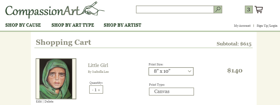
iii. Additionally, the observation and questionnaire highlighted the navigational problems from the shopping cart page. Users struggled to return to shopping after viewing their cart. Therefore, I added a “< back” navigation link to the top of the page, to bring the user to the last page they viewed. This will allow the user to transition back to shopping seamlessly after viewing their cart. I also noticed the redundancy of the “edit” link on the shopping cart, because the shopping cart page already has all of the product selection editing capabilities that are offered. After this realization, I got rid of the “edit” link.
Original
revision

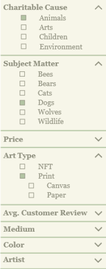
iv. The interview gave insight into what capabilities and features the user group expects to see on an ecommerce site. The key features listed by users were price and customer reviews. I chose to use this information to improve the filter menu on the category pages. First, I focused on reordering the hierarchy of the filter menu categories. I moved “price” higher on the list, since it is such an important element to users. I also added a “avg. customer review” category after this evaluation proved the importance of customer reviews in ecommerce. During a study of 30 ecommerce sites, UXPlanet.org found adding filters can increase a website’s conversion by 26%.² Filtering helps the user find products quicker because according to Hick’s Law, the more options are available to a person, the longer it will take for him or her to make a decision about which option is best. Filtering decreases time-on-task, which will increase the likelihood of the user completing the task. According to Adobe, “task time measures the efficiency and productivity of the product or service. It is a core usability metric. If the user spends an extended amount of time completing an action, that means the interaction is not properly designed. Time is an important factor when considering the effectiveness of the solution.”³ Too many filters can have a negative effect though, once again according to Hick’s Law, so I only added one category that the interviews proved to be very important to users (customer reviews).
² https://uxplanet.org/9-filtering-design-best-practices-to-improve-e-commerce-ux-edac50560f94
³ https://xd.adobe.com/ideas/process/user-testing/usability-metrics-measuring-ux-design-success/
Original

revision
iv. Overall, the evaluation highlighted that CompassionArt’s website had a positive response from users in terms of the design of the site. It also showed that the site includes all of the key features that the user group expects to see on an ecommerce site. One of those key features was customer reviews; based on that information, I made some improvements to include a “top-rated products” section on the product page. I also added a “avg. customer review” to the filter menu on the category pages.
v. While there was a positive response to some aspects of CompassionArt’s site, the evaluation also highlighted that there were opportunities to improve the functionality of the navigation to improve navigation. These opportunities included a pop-up window with links that displays after the user presses the ”add to cart” button from the product page. This will give the user the option to continue shopping or view their cart. It is an improvement because it gives the user the choice as to how they want to continue, whereas before the user was just sent directly to the shopping cart. I also added navigation links on the shopping cart page to allow the user to seamlessly return to shopping after viewing their cart.